· 10 min read
How to design a QR Code that actually scans
A QR Code is a machine-readable image that designers are constantly asked to make pretty. Here is exactly how much prettiness the decoder will tolerate, and where the limits come from.
What the scanner is actually doing
Before any rule makes sense, it helps to know what happens between the camera and the URL. A decoder runs roughly five steps:
- Greyscale. Colour is discarded immediately. Whatever palette you chose, the decoder sees light and dark.
- Threshold. Each pixel is classified as module or background, usually with a local adaptive threshold so that uneven lighting does not ruin the whole image.
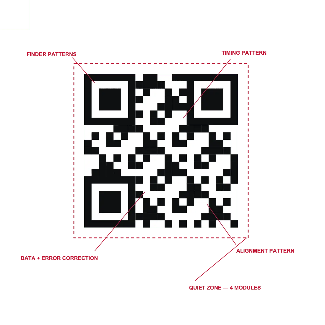
- Locate. The three large corner squares — the finder patterns — are found by their distinctive 1:1:3:1:1 ratio of dark and light runs. This is why they must never be covered or restyled.
- De-skew. The alignment patterns let the decoder correct for perspective, so a code photographed at an angle still resolves onto a square grid.
- Decode and repair. Bits are read, and Reed–Solomon error correction rebuilds whatever was damaged, up to the level's budget.
Every design rule below is a consequence of one of those steps. None of them are aesthetic preferences.
Contrast: the number, not the feeling
Because step one throws away colour, the only thing that matters is the luminance gap between your modules and your background. The WCAG contrast ratio is a convenient way to measure it, and it is what our tools show.
| Ratio | Verdict |
|---|---|
| 7:1 or higher | Print it. This is the target. |
| 4.5:1 to 7:1 | Works on a clean print in good light. No margin for ink spread or a dim room. |
| 3:1 to 4.5:1 | Older phone cameras will struggle. Expect complaints. |
| Under 3:1 | The thresholding step cannot separate the two. It will not scan. |
Two colours that look completely different can be nearly identical in luminance. A saturated red on black is the classic failure: visually dramatic, and about 2:1 once greyscaled. If you want colour, take it from the dark end — a deep navy, a forest green, a burgundy — on white or a very pale tint.
Test it in thirty seconds
The quiet zone: four modules, no exceptions
The specification requires four modules of clear space on every side. Its job is to tell the decoder where the symbol ends, which matters more than it sounds — without it, a decoder scanning a busy poster has no reliable edge to work from.
This is the rule broken most often, because trimming it looks better and the code still works on screen. On paper, against a coloured background, held at an angle, the failure appears — and it is intermittent, which makes it worse. Half your customers succeed, the other half conclude your code is broken.
In practice: keep four modules, keep them the same colour as the code's background, and keep other artwork out of them. On a 30 mm code that is roughly 3 mm of clear space on each side.
Logos: the arithmetic behind the limit
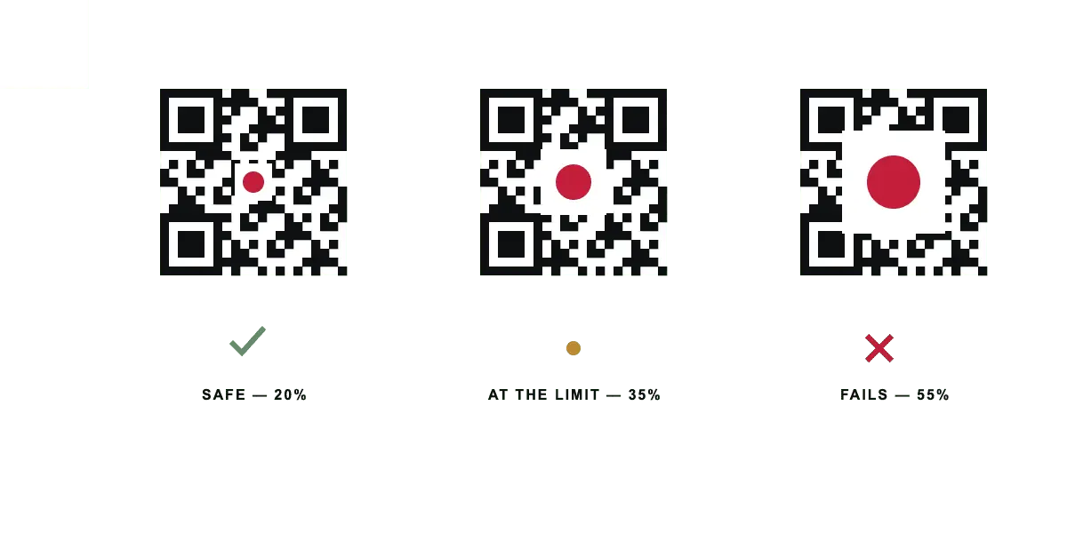
A centre logo destroys modules. Reed–Solomon can rebuild them, up to the budget of your error-correction level: about 7% of codewords at L, 15% at M, 25% at Q and 30% at H.
Nearly every guide stops there and tells you a logo can cover up to that percentage. We published a version of that rule ourselves, then measured it — rendering symbols across versions and levels and decoding each one — and found it promises sizes that do not survive on small codes. Two things are missing from the simple version.
The white plate is a fixed cost
A logo needs clear space around it or its edge merges into the neighbouring dark modules and the decoder loses the module grid. That plate destroys modules exactly like the logo does — and it is a fixed number of modules, not a percentage.
Two modules of plate on each side is 4 modules of width. On a 21-module version 1 symbol that is 19% of the width gone before the logo is drawn at all. On a 109-module version 23 symbol the same plate costs 3.7%. Same plate, five times the relative damage. Any rule expressed only as a percentage of width is wrong at one end or the other.
Contiguous damage is worse than scattered damage
The recovery percentages describe codewords spread across interleaved blocks. A centre logo wipes out one solid region, and on a low-version symbol — which has few blocks to begin with — that region can take out most of a single block. Spending the whole nominal budget also leaves nothing for the fold, the scuff and the glare the redundancy was there for in the first place.
What we actually publish
So the rule is: logo plus plate must cover no more than 40% of the nominal recovery capacity, measured in area, against the symbol's real module count. That gives a limit that moves with the size of your code:
| Symbol | Level M | Level Q | Level H |
|---|---|---|---|
| 21²–29² (versions 1–3) | No logo. See below. | ||
| 33² (version 4) | 12% | 20% | 23% |
| 41² (version 6) | 15% | 22% | 25% |
| 57² (version 10) | 17% | 25% | 28% |
| 77² (version 15) | 19% | 26% | 29% |
| 109² (version 23) | 21% | 28% | 31% |
Figures are the maximum logo width as a fraction of the symbol width, with two modules of white plate on each side already accounted for. At level L the plate alone exhausts the budget on anything under about version 8 — which is a polite way of saying do not put a logo on a level L code.
Under version 4 we give no figure at all. The area model over-promises there: a small
symbol has few error-correction blocks, so one contiguous hole can take out most of a
single block, and measured decode limits fall below what the arithmetic predicts. A
tel: code is version 1. It does not get a logo, and we would rather say so
than hand you a number that fails on a customer's phone.
The 40% factor is not a guess either. It is set so the published figure sits under the point at which decoding measurably stops, across every version and level tested, with margin. The generator runs the check live against the symbol you actually have rather than quoting a table, and the calibration is a script in the repository so the numbers can be re-derived rather than believed.
Three further rules, all non-negotiable:
- Never cover a finder pattern. Those are how step three works. No amount of error correction replaces them, because the decoder never gets far enough to try.
- Give the logo a white plate. At least one module — two is better — of background colour around it. Count it against the budget: it is part of the damage, not a frame around it.
- Raise the level when you add a logo. Q or H. This is the one situation where the density cost of higher error correction is clearly worth paying — and raising the level grows the symbol, which raises the logo budget twice over.
- Do not put a logo on a small symbol. Below roughly 33×33 modules the plate eats most of the budget. If the payload is short, the code is small, and a logo is not worth what it costs you.
Size, restated briefly
Design and size interact: every compromise you make on contrast, logo or module shape
consumes margin that you then need to buy back with a larger printed code. The governing
number is module size in millimetres — printed width ÷ (4v + 17 + 8) for a
version v symbol with the standard quiet zone.
Roughly 0.6 mm per module is comfortable on an office laser printer, 0.85 mm on a thermal label printer, and 1.2 mm or more on vinyl. The print size checker runs the whole model for your exact content and print method.
Surface and finish
- Gloss laminate and spot varnish. The worst offender. They reflect the flash into the lens and erase the centre of the image. Choose matt.
- Curved surfaces. Bottles, cups, tubes. The de-skew step handles perspective but not cylindrical distortion. Keep the code to roughly a quarter of the circumference and add error correction.
- Fabric and knitwear. Module edges blur into the weave. Give it two to three times the module size you would use on paper.
- Metal and engraving. Low contrast by nature, with rounded module edges. Level H and generous sizing.
- Behind glass. Reflections again. Print larger and, where you can, choose the side of the window with less glare.
The test that catches everything
Design checks are useful; a real scan is definitive. Before any print run:
- Print the actual proof at the actual size on the actual stock.
- Scan it with at least two phones — one recent iPhone, one mid-range Android. Those two cover most of the field.
- Scan at the distance people will really use, not with the phone pressed against it.
- Scan in poor light. An indoor evening, no flash.
- Scan at an angle, about 30 degrees off perpendicular.
- If the piece will be laminated or varnished, scan it again afterwards.
Any failure in that sequence is a failure in the field, multiplied by your print run. It takes five minutes and it is the only check that counts.
FAQ
Frequently asked questions
Can a QR Code be any colour?
Can I invert a QR Code — light modules on a dark background?
How big can a centre logo be?
Why does my code fail after lamination?
Do rounded or dot-style modules still scan?
What is the single most common reason printed codes fail?
Make one now
Every generator on this site produces a static code, in your browser, with no account.